Bible Design: Illuminated Manuscripts to Postmodern Power Plays
November 18th, 2008 in Design Inspiration
by: Matthew Griffin
How does design affect the way we read and interpret God's word? I started considering this question recently after Isral Duke, a designer out of Baton Rouge, contacted me with a thought provoking . By nature, design adds an interpretive grid to a body of information. Even the most unintrusive layout communicates subliminally about the designer's view of the contained text. And since God's specific revelation to man (the Bible) has been given to us as written literature, the importance of the design containing its text should be of great concern to us. Until now, I've never seriously considered the implications of Bible design. How has it been approached in the past? What is modern design doing to the Bible today? And most importantly, how will this generation of designers shape Bible design in the future?
The Illuminated Manuscripts

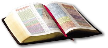
Interestingly enough, the Biblical manuscripts with the most breathtaking design were produced long before Gutenberg fired up his printing press; they are called illuminated manuscripts. Monastic scribes hand wrote these Bibles leaving room in the layout for illustrators to come in after them and add decorative initials and detailed illustrations. Unfortunately, the labor intensive nature of this process made Bibles scarce and expensive. A layman in the church owning a Bible was almost unheard of; even many small and rural churches couldn't afford a Bible. And when a church was fortunate enough to have a copy of the Bible in Latin, it was usually chained to the pulpit to prevent theft and (at least practically) keep it out of the hands of the laity. This practice of "illumination" which started, no doubt, as an act of honor for God's word gradually became exalted above the Word itself. Illustrations became increasingly grandiose as the time of the reformation drew near. In some cases, entire pages were taken up with ornamental initials. It was no longer the meaning of the text that was the object of power, but the book itself as a mystical object. We can see then how from early on, design projected an interpretation on the text. In this case design degraded the text. But that was about to change.
The Age of Mechanical Printing

The cry of the Reformation, "Sola Scriptura" (scripture alone), saw its physical manifestation in the Gutenberg Bible. Gutenberg's printing press stole the focus from illumination and brought the manuscripts to the laity of the church. To be accurate, Gutenberg's Bible didn't completely strip illumination from the text—key portions were still hand-drawn. But the shift from the fully hand written and illuminated manuscripts was so radical that the embellishing touches in Gutenberg's Bible are hardly worth mentioning. Robert Estienne (the inspiration for the naming of Mirificam Press) soon added the chapter and verse markers we still use today. Where design had been used strictly to beautify in previous centuries, it was now being used for more practical concerns: to organize and clarify. This view of design was in accordance with the reformer's view of scripture. Typography became a legitimate vocational field and an increasing effort to translate and print the Bible in common languages brought professional design to the eye of the public.
The Bible with Modern and Postmodern Design
As far as design is concerned, the changes in Bible printing from the time of the Reformation up through the modernist era were relatively small. The modernists essentially continued to strip out the already waning illumination in Bibles and elevated a utilitarian design to a point which, arguably, would have offended their predecessors in the Reformation. The modernist is not concerned with beauty as an integral part of design—as a virtue in and of itself. The modernist is focused only on practical issues: organization, cost per unit, etc. Also, most protestants were already suspicious of anything that looked Roman Catholic, so the modernist trend fit nicely with American evangelical sentiments. The modernist Bible design still makes up the overwhelming majority of printed Bibles today.
But just as evangelical Christianity was gradually infiltrated by modernist philosophy, we are now seeing postmodernism make its way into Bible design. When I refer to postmodernism here, I'm referring to postmodernism as a philosophy; not the graphic design movement of the 1970s and 1980s. Postmodern philosophy proposes that all communication can be reduced to power plays. So, for example, if I passionately defend an unborn child's right to life, it's not ultimately because there is a right or wrong. Rather, my attempt to persuade is a manipulation—a power play—intended to increase my dominance or the dominance of those by whom I myself am being manipulated. The sophists in ancient Greece held a similar position. They were masters of public speaking and persuasion. But their persuasion was not for the sake of truth; it was for the sake of persuasion itself.
When postmodernism is applied to Bible design we see a unique fusion of graphical interpretation and text. Rather than being used to beautify (illuminated manuscripts) or clarify (reformation), design is now being used to force meaning into the text and manipulate readers. The Rainbow Study Bible (Broadman and Holman Publishers) released in 1960 is an early example of this. In the Rainbow Study Bible virtually every paragraph is set against a specific background color which, in turn, is associated with a category. Now, I realize this is a relatively benign example, and you could argue that the color coding was intended purely for clarification purposes. Nevertheless, we can't ignore the fact that, for the first time in a widely distributed printing of the Bible, design was being applied as a layer of interpretation on top of the biblical text itself. It wasn't in a footnote section. It wasn't ornamental lettering.
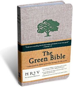
A more vivid example of full-on postmodern Bible design is found in the recently released Green Bible. The Green Bible illustrates that "God is green" by highlighting in green all scripture passages with instructions concerning mankind's management of the earth. The Green Bible is printed and bound on recycled material using only soy ink. Much like the Rainbow Study Bible of the 1960s, we see design infused into the actual text. But this time it's for purely rhetorical purposes. Where the schizophrenic niche Bible design dances around the text, the Green Bible invades the text.
A Timeless Design for Scripture
A truly Christian design of the Bible is one of balance. It is excellent, beautiful, and well organized. It does not elevate utilitarian concerns to the exclusion of beauty. Nor does it elevate embellishment to the exclusion of meaning. Its aim is toward God's truth, not personal rhetoric. It is not afraid of legitimate graphical diversity. And It respects the text as a unified work of literature. When we ignore these basic principles and give into postmodern Bible design, we are contributing to disarray and confusion within God's people. We are the designers of the future and it's up to us to shape Bible design for future Christians. I pray that we will glorify God in our efforts.
On a final note, Isral Duke, who I mentioned in the opening paragraph is producing some interesting work right now involving diagramming scriptural truths as stand alone works of art. And while this isn't specifically Bible design, I think he is showing us how design can be used to clarify spiritual truths. Of his work, Isral says:
In a world that is always bombarded by marketing, we need this work to be in the world, not chained by the meanings within the symbols of the world.
I would love to see this train of thought applied to some of our classic creeds and confessions.
- 20 Comments
- 18848 Views
Comments
Posted By: Brandon on 11/18/08
I had this same thought the other day as I was standing in a bookstore looking at all the different shapes, sizes, colors, and covers of Bibles. I'm glad to see the beautiful arrangement of Scripture in a nice cover, but I agree with you that we need to be balanced as well. Like the web, it's really the content that counts! Thanks for the thoughts about this.
Posted By: Matthew Griffin on 11/18/08
Thanks, Brandon.
Posted By: GB on 11/18/08
Wow, Matt. To say that �you've come a along way, baby� would be a gross understatement! Excellent thinking, excellent doing. I was a little surprised to see that you omit mention of my favorite interpreto-designo-whipping-boy Bible, the �red letter edition.� As you know, this design, which originated a few decades ago, has all of the words of Jesus set in red type, thereby distinguishing them from the words spoken or written by the other, just plain ol� Holy Writ writers, such as Paul, or David, or Moses � or even God the Father! Setting apart some passages of Scripture from others, regardless of the speaker or author, represents a spurious imposition of a hierarchy of authority on the content of Scripture, a purely human assessment of the �degree of God-breathed-ness� of the various parts. The necessary, and terribly serious, implication of this practice is that not all of Scripture is true. Very scary� But on the lighter side, how do we classify this design: Marcionite power-play? subliminal dispensational down-dumbing? publisher propagandizing? In any case, this red letter design, having now infected even the most orthodox of translations, is far more widespread than both the Rainbow and Green Bibles you mention, and therefore the theological error ramificating (pardon the W-ism) from it perhaps serves as a better case in point for your musings in future Mirificam offerings � which I dearly hope you will continue!
Posted By: Matthew Grffin on 11/18/08
Great point, Greg, and thanks for the compliments. The red letter edition is a perfect example. In fact, I remember a Christian pop song from a few years ago whose chorus when something like: "There is truth in the red letters. There is power in the red letter." Of course, there is truth and power in the red letters but the implication is that they are more powerful than the black letters.
Posted By: Robert on 11/20/08
Interesting post Matt. As you may know however, I would say it�s not the design that counts at all, it�s the ability to �rightly divide the word of truth� from the rest of Scripture. As you know, even �the wisdom of God� in the �old covenant� scriptures, and that contained in the books of Hebrews through Revelations can cloud men's view of the only gospel message which is �the power of God unto salvation� today. So, any design convention that would wittingly or unwittingly detract from �the gospel of Christ � the gospel of the grace of God� shining forth in all clarity is undesirable. But if I could suggest a design, it should be one that highlights Paul's thirteen letters, wherein the only authorized �gospel of our salvation� is unfolded for us today. In short, in the current dispensation in which we live today, all the �wisdom of God� found in all the other books should rightly be viewed in the light of Paul's pr/teaching. (ref. Titus 1:3; Col. 1:25) In Christ, -Robert
Posted By: Matthew Grffin on 11/20/08
Thanks for the comment, Robert. Unfortunately, I have to disagree. To infuse dispensational rhetoric into the text of the Bible via design would be unconscionable. It would be imposing a johnny-come-lately view that has not been held by historical Christianity. But more importantly, it would be breaking the long tradition of biblical exegesis (to lift out the meaning), replacing it with the dangerous practice of eisogesis (to put in the meaning). Design matters.
Posted By: Clubturk.net-2. Seo Yarismasi on 04/27/09
Great point, Greg, and thanks for the compliments.
Posted By: Rabbits on 10/20/09
lovely point all the dispensationalism and thus the schofield versuion whuich did so much theological damage to the evangelcial church.