Creating CSS Flair Elements for Clarity and Style
April 8th, 2009 in Design Tips & Tutorials
by: Matthew Griffin
We spend a good chunk of time in each new project developing layout mockups and converting them to solid web templates (or at least I do), and rightly so. We want our templates to look sharp and function well. But there's a temptation, once the sharp-looking template is set up, to get sloppy and bland with the content. It's easy to fall into this trap because the template can usually provide enough flare to get us by. That won't cut it on sites that are content intensive or require high design. But by making a habit of "pre-styling" a short list of HTML elements, you can make sure that the content on all your sites is easy to read and looks professional. In this article we'll take a look at these elements along with some effective styles that will add flair and clarity to your content. All of the examples below can be seen in action here.
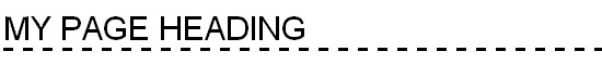
1. Titles and Headings
A heading is the first thing a visitor will see after his eyes move away from the template, so it's important that your H1, H2, and H3, tags are well styled. Obviously, your headings should be bigger and bolder than regular body copy, but you should also consider adding some additional attributes to liven them up and set them apart. Here are a couple of examples of H1 header styles that do just that.
h1.style_one {
font: 30px bold Geneva, Arial, Helvetica, sans-serif;
border-bottom: 3px dashed #000;
text-transform:uppercase;
color: #000;
}
h1.style_two {
font: 30px bold Geneva, Arial, Helvetica, sans-serif;
color: #666;
background: url(images/flare_001.gif) no-repeat top left;
padding-left: 50px;
text-transform:uppercase;
}

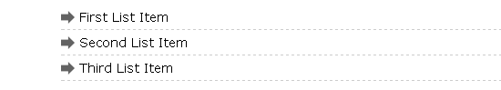
2. Unordered List Items
Default unordered list items are pretty bland. You can make them easier to read and more aesthetically consistent by adding an appropriate background image and using extra space or a light border to separate them.
ul.style_one li {
list-style: none;
background: url(images/flare_003.gif) no-repeat 0 2px;
margin: 0 0 5px 24px;
padding: 0 0 5px 20px;
border-bottom: 1px dashed #ccc;
}
ul.style_two li {
list-style: none;
background: url(images/flare_002.gif) no-repeat 0 5px;
margin: 0 0 10px 24px;
padding-left: 20px;
}

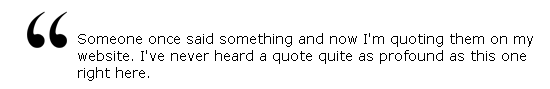
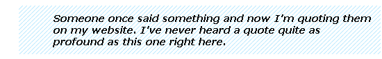
3. The Blockquote
If you're using the blockquote tag correctly, it will function just as the name implies: as a quote. With some text manipulation and a background image, block quotes can become a thing of beauty.
blockquote.style_one {
background: url(images/flare_004.gif) no-repeat top left;
padding: 20px 0 0 50px;
margin-left: 24px;
}
blockquote.style_two {
background: url(images/flare_005.gif);
padding: 10px 10px 10px 50px;
margin-left: 24px;
font-style: italic;
font-weight: bold;
}
4. Paragraphs
I was tempted to build my own examples of paragraph formatting but Jon Tan did such a good job in his 12 Examples of Paragraph Typography that I decided it would just be redundant. Go check out the article; I'm sure you'll find everything you need to style your p tags and more.
5. Links
Links make the web go round, and it's important that the links on your site match the the template and can be clearly distinguished from ordinary text. With that in mind a black underline on black text is probably not the best way to accomplish this. The default link color is fine but we want to put that professional sparkle on our links. Here are a couple examples.
a.style_one {
color: #0082bf;
background-color: #ddf3fd;
text-decoration: none;
border-bottom: 1px dashed #0082bf;
}
a.style_one:hover {
color: #0082bf;
background-color: #fff;
text-decoration: none;
border-bottom: 1px dashed #0082bf;
}


a.style_two {
color: #0082bf;
text-decoration: none;
}
a.style_two:hover {
color: #0082bf;
background: url(images/flare_003.gif) no-repeat 0 2px;
padding-left: 20px;
text-decoration: none;
}


That's it. Make sure you style these five elements on every site you build and you can't go wrong. If you want to see all of the example above in action on one page, just go here.
- 30 Comments
- 12300 Views
Comments
Posted By: Edgar on 04/08/09
Thanks. I saved this for the next time we redo our design
Posted By: nate on 04/08/09
Nice paragraph resource. I hadn't seen a lot of those style options before.
Posted By: Matthew Grffin on 04/08/09
Thanks, Edgar and Nate.
Posted By: Jared on 04/09/09
Not a bad idea, but I would suggest using a more semantic name than sytle_1 or style_2. Maybe something like ul.arrow_bullets li, ul.square_bullets li. This way you can create reusable chunks of code and know what they do by just the name of the selector.
Posted By: Scott Radcliff on 04/09/09
Agreed. I use these also, and I am a huge fan of clean web sites with lots of space. These CSS rules are a must have.
Posted By: Matthew Grffin on 04/09/09
@Jared: Yeah, I go back and for on that one. I actually think the best solution is to use more generic names and put in comments about what they are. That way, if two years from now, your "arrows" change to "dots", you won't have HTML classes that don't match. You can just change the CSS, change the comment about what it does and you're done.
Posted By: Matthew Grffin on 04/09/09
@Scott: Thanks.
Posted By: Rob W on 04/10/09
Good article, with clear & simple examples! Good timing, too, as I was just thinking that I should start using these techniques.... One important thing, though -- you mean "flair", not "flare"! That confused me at first -- I thought you meant lens flare. "Flare" is what bell-bottoms have at the bottom, or what you light and put in the road when your car breaks down at night (or some other flash or outburst). "Flair" is more like a flash of style or elegance (or, an aptitude for something).
Posted By: Rob W on 04/10/09
Side note: apparently linebreaks in comments are discarded.
Posted By: Matthew Griffin on 04/10/09
@Rob W: Hmmm... I'll have to think about that--flare vs. flair. I guess I can change the title but the permalink won't match.
Posted By: Rizwan on 04/11/09
hmmm...this is good....ws planning something on similar lines......good article to bookmark
Posted By: on 04/14/09
great post dude. http://tutorialfeed.blogspot.com/
Posted By: Greyholme on 04/30/09
Great post Whenever I apply a new theme in Wordpress I am surprised by how bulky their stylesheets are. This is a great example of how to keep CSS light. One issue I have with creating my sheets is picking a font I like so I also put together a page the shows examples of each font family. Makes it easy to pick a <a href="http://www.eligr.com/css-font-style/"> font family</a> without having to test different styles. Hope this is helpful
Posted By: Michael on 05/19/09
Defining a bunch of styles like this ahead of time is a great way to add some visual variety that is consistent throughout the site.
Posted By: Propecia Online on 06/01/09
wow.. very nice post thanks!!!