Design Interprets. Design Speaks. Design Matters.
December 2nd, 2008 in Business & Process
by: Matthew Griffin
A couple of weeks ago, I posted an article featuring various Bible designs and explaining how they serve as an interpretive layer on top of the biblical text. This concept of design as interpretation has deep implications for designers. Our work acts as a series of bridges between raw data, solutions, and people. When one of these bridges has a green wire crossed with a red wire, the whole system may fail to accomplish its task. But how do we get it right? What are the rules? Where are our personal tastes legitimate, and where are they harmful? And how can we best ensure that we are we are both interpreting correctly and that our solution matches our interpretation?
Design Interprets
I think it's clear that design involves interpretation. But we need to be consciously aware of this as we collect the data that will inform our design. In most cases we are at the mercy of a client, and, of course, we have to listen to everything they tell us. But the effective design process involves more than just listening to the words of the client. It also involves listening to the market and the trends. It involves research. It involves fact organizing. Ultimately, it can be summed up as a gathering of project constraining criteria. This is where the interpretation of the designer is critical. It's where the expertise of the designer will either shine through or fall short. A designer who can't properly constrain his or her interpretation of project criteria will never be able to effectively accomplish the given purpose of the project. For the same reason, a designer who can't stand up to a client's bad interpretation of data will fall into the same pit.
A few months ago I was doing some consulting for an oil drilling company. Part of their operation involved convincing private land owners to sell the mineral rights to their land and let the company drill an oil well on it. In West Texas everyone knows this company. They have a good reputation. They've always worked hard to be as noninvasive as possible on private property. They developed an underground pump that's hardly noticeable from the ground level, and they're sensitive about trees and other land characteristics that may have sentimental value to property owners. West Texans know this, but the population outside of West Texas doesn't.
This was the initial data. Based on this information, they decided to build a website that would introduce the company to the outside population. I looked over their material and I thought they were on the right track. They had the pertinent data and I felt they were interpreting it correctly. A website would be a good move to educate land owners and make expanding operations go more smoothly. Then they showed me the logo they wanted to use on the website. It was a vector drawing of an old fashioned oil derrick with oil spewing from the top—a gusher. I don't think I could come up with a symbol more contrary to the message the company was trying to get across.
Where was the disconnect? This company understood their own need. They understood the need of the potential seller. And they understood the information they needed to communicate in order to connect themselves to the potential seller. But when it came down to the solution, they thought an oil geyser would best symbolize their project. Their problem was not a lack of information. Their problem was that, instead of confining their solution to the pertinent criteria, they threw the pertinent data out at the last minute and exchanged it for a different set of data, a broader set of data—the data of personal taste. These guys liked the thought of a gusher; it symbolizes more profit. But that's not what they needed to communicate to land owners. They should have submitted their solution to the governing criteria of purpose.
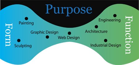
In early 2008, I posted an article called Function vs. Form: Rescuing Design from Insanity. In that article I proposed that fine art and design are merely the opposite ends of a spectrum that is subordinate to purpose. This is in opposition to the belief that form and function are separate categories altogether—representing two irreconcilable worldviews. To illustrate my point, I came up with this diagram:

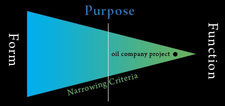
And while I still think this illustration is valid, I would like to make an important revision that I think will clarify the concept even further:

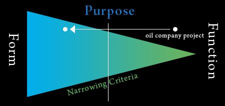
In this revised diagram, the criteria restricting the design solution becomes narrower as the spectrum nears the function pole. On the other end of the spectrum where the "finer arts" reside, the criteria broadens. My oil drilling company is an example of a project that would appear somewhere close to the function side of the spectrum. And yet the solution allowed out-of-bounds criteria to determine its form. Interestingly enough, the gushing oil derrick would have been better categorized as fine art than design. But since its purpose is a practical function, it really ends up completely out of bounds—something like this:

And this is all because the "designers"—in this case IT workers and petroleum engineers—did not understand design as interpretation.
Design Speaks
If design interprets, design speaks. Design speaks the second the interpretation of the designer springs forth as a tangible solution. I'm not just saying that design can help people understand something better; I'm not just saying that design can make information consumption easier for the masses; I'm not just saying that design can make peoples lives easier and more efficient. Design can do all these things. But because, as I explained earlier, design is a bridge connecting data, solutions, and people, design also speaks about the designer. The designer's worldview is necessarily fused with his or her interpretation of data and, therefore, it is necessarily fused with his or her design solution. Don't think your philosophy of life affects your design? Think again. It is a logical necessity that it affects your design. The question is: in the buffet of worldviews in our postmodern culture, what will you use as your worldview foundation? Notice the question is not if you will choose a worldview but what it will be. When designers begin absorbing worldview ideas that contradict reality, the result is design and art that fails to fulfill its purpose. On the other hand, when we first align our efforts to the ultimate reality of God's purpose for man, and then allow other sub-purposes to fit into that grid, we will find that design speaks truth—it conforms to reality.
Design Matters
Well, of course we think design matters. We're designers! There are many, though, who hold design/art up as a substitute religion. They believe that design can "fix" the world. This is not what I mean when I say that design matters. Design matters because it has the power to either distort truth or affirm truth. What greater power could a vocation possess? And yet, whether or not we affirm truth with our worldview (and by association, our design), truth stands. In actuality we have no power to make truth. We only have power to twist truth. When we affirm truth, we simply conform to reality.
At first glance my points and illustrations about art and design seem to make sense. But keep in mind that there are powerful design movements from the past and present who would find my thinking appalling. Why? Because, in order to have a world in which function and form exist simultaneously—a world in which both function and beauty are real, legitimate concepts, you must have a source that is both unified and diverse. This is why the modernists said that beauty is an illusion and postmodernists said function is an illusion. Ultimately, they can't exist together without a unified but diverse Purposer.
- 14 Comments
- 6068 Views
Comments
Posted By: Timothy Long on 12/02/08
Another great theory-driven piece, Matt; but I think there are a lot of practical ideas floating around here too. Knowing the market is not enough. You have to have the ability to impart that information to clients in a way that makes sense to them. I read an article recently which emphasized the importance of bringing the focus off of the client's personal feelings and toward the predominant focalpoint: user experience.
Posted By: Matthew Griffin on 12/02/08
Convincing clients to focus on the right data is an important part of the process. Maybe in another article I'll discuss my process for accomplishing that. Thanks for the comment, Timothy.
Posted By: VIncent Rhodes on 04/18/09
I love this article. Jesus said you shall know the truth and the truth shall maake you free. Truth is the original design of mankind that Satan through our sin has marred. We were designed by One who is truth and our form and function was originally was a true design. When form meets function, power is the result.
Posted By: Matthew Grffin on 04/20/09
Thanks, Vincent.
Posted By: Media Designer on 05/22/09
Fantastic article. Thankfully I don't believe that design can save anyone, but is a medium for the message, and should get out of the way of the messenger. Like someone else said, design is the crystal goblet holding the wine.
Posted By: Matthew Griffin on 05/22/09
Thanks for the comment, Media Designer.