Total Redesign: Mirificam Press Dissected
June 23rd, 2008 in Design Inspiration
by: Matthew Griffin
Bits O' NewMedia has officially made the transformation into Mirificam Press (as you can see). The task of creating a new design that fit the personality and direction of the blog ended up being more difficult than I had anticipated. At least part of the difficulty was due to the fact that I didn't have any constraints. I've become so accustomed to doing things within the client/designer relationship that I almost forgot how to work for myself. My wife would probably argue that, in reality, I just substituted her for the client and never actually broke out of the client/designer relationship. I'm sure, "What do you think about this?", isn't her favorite question right now. But I digress. Through all this, I was able slow down and make precise and deliberate design decisions that I'm not always at liberty to make in other situations. I'd like to kick off the new site by dissecting the new design and features.Type Hierarchy and Guiding Color

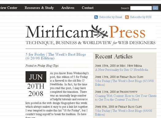
Since this site is a high text content site, my primary objective in its redesign was readability. The information architecture behind Bits O' NewMedia worked well for fifty articles, but wasn't able to scale very well beyond that without losing important articles in a cluttered archive. This is why Mirificam Press is a more typography-driven site than Bits O' NewMedia. It became clear that is would be important to use use colors and type more subtly and consistently to guide visitors. I kept the color palette simple and graphic devices minimal. The blueish color is used consistently throughout the site to denote links (except for the main navigation in the header). Orange is used to signify headers of importance: article titles, page titles, and major page sections like comments. Finally, the light beige/cream color serves as a focus box background and focus box borders. You'll also notice a consistent graduation of text size and transformation throughout the site that will help visitors understand what titles and text are most important from page to page.
The Baseline Grid
Although it's a common tool in print design, the baseline grid was a new concept for me. The idea is that by using a consistent line-height for your text graphical elements throughout a site, an eye-pleasing vertical symmetry can be created. In the case of Mirificam Press, I set my default line-height to 18 pixels. This means that from the baseline of one line of text to the baseline of another is exactly 18 pixels. If the text size of any heading exceeds 18 pixels, then the line height of that heading has to be adjusted up to the nearest multiple of 18. The same thing goes for top and bottom margins and padding. They all have to be multiples of 18. Here's an example of what the home page looks like with an 18 pixel horizontal line grid behind it. You can see that every line of text fits perfectly into the grid. If you'd like to see a live version, you can go here.
Unfortunately, building a good baseline grid is difficult when you're using EM or percentage measurements. I had to use a pixel measurement for all of the elements of the layout which means that the layout doesn't fare very well when a visitor manually adjusts browser text size. It's not optimal but the site still remains fairly accessible for those darn text size changers.
Good Markup Makes All the Difference
I don't think it's possible to understand how important good HTML markup is until you try to move a blog to a new design. Fortunately, I consistently used H3 tags for sub-headers, UL tags for lists, P tags for paragraphs, etc. I also used consistent classes for floating images which makes it easy to restyle them for the new site. I can't imagine what nightmare this change would have been had I been sloppy with my markup. As it stands, most of my archived articles fit perfectly into the stylesheet.
The old Bits O' NewMedia template, on the other hand, was not as light-weight or semantic as it could have been. The Mirificam Press template markup is a significant improvement in this area. If you use the Firefox web developer tool bar, you can disable styles and you will see something that looks like this (or go here for a live look):
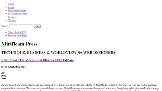
Take a peek at the source code, you will see light, well-formed XHTML that uses semantic markup for headings, navigation, etc. Of course, just like Bit O' NewMedia, Mirificam Press has a print stylesheet and I plan on looking into a mobile stylesheet in the near future. Be sure I'll also post a mobile stylesheet tutorial when I finish.
Easier Layout
Bits O' NewMedia followed the traditional two-column blog layout pretty closely. But as content increased, I found that the two-column blog layout wasn't the best fit. Articles tend to pile up on the home page making for endless scrolling and the persistent right-column content that gets pulled up on sub pages whether or not it's relevant.
The home page layout on Mirificam Press features a teaser for the most recent article and a list of seven preceding articles, all in the initial viewable area. Scrolling down reveals a three-column feature box that provides quick access to articles by topic, and most views. The sub-pages on Mirificam Press are in an uncluttered one-column layout. This change from the home page to the sub pages makes them easier to read and less confusing overall.
If you're sporting a modern browser, you'll get a persistent fixed navigation bar as you scroll down the screen along with a fixed background. The fixed navigation has obvious benefits but I wanted to do something more that just beneficial—I wanted something that was different and cool (This is a design blog after all). I ended up playing with the fixed background and pushing the nav bar down a little so the content shows through in the little gap at the top of the screen as the page scrolls. Hey, it's something, right?
Resources and Study
I've spent most of this article explaining the technical qualities of the new site. But this change isn't strictly an image adjustment; it's also a content reorganization. Writing articles (especially Christian worldview articles) on Bits O' NewMedia was great, but the here-today-gone-tomorrow system that drives the typical blog makes it difficult to develop a complete system of thought on a particular issue. The Resources and Study page is an attempt to fix this dilemma. I will continually expand and update it with resources for not only becoming a great web designer, but becoming a great web designer with a solid Christian worldview. Eventually, I plan to compile a comprehensive curriculum to this end. For now, you can go there for recommended websites, blogs, and resources.
The Worldview Center page is another page that will be updated frequently. Worldview is one of the most important concepts for Christian designers to understand and embrace if we are ever going to engage and impact culture. Unfortunately, as a complete system of thought, it can't be explained in one article. The Worldview Center will provide a place for web designers who are new to the concepts of worldview to catchup. In the future, I'll be moving into deeper and more specific areas of worldview in web design and, rather than rehash the basics every time, I'll point to the Worldview Center as a primer.
- 11 Comments
- 1708 Views
Comments
Posted By: Andrew Cantwell on 06/23/08
Hi Matthew -- really like the new site design, and how your support the design decisions in your dissection -- still tossing up about the title tho (grin). Surprised there are not more comments. Cheers - Andrew
Posted By: Matthew Grffin on 06/23/08
Thanks, Andrew. I actually lost some sleep over the title but in the end I wanted something with deeper roots than Bits O' NewMedia. Hopefully it will grow on you.
Posted By: Brad C on 06/23/08
very nice work. I really like the fixed navigation and sidebar. Where did the illustration come from and I'm betting there is some symbolism behind it.
Posted By: Jason Cochran on 06/23/08
My guess as to the title (I am probably far off): Inter Mirifica is the Second Vatican Council's Decree on the Media of Social Communications. It was approved by a vote of 1,960 to 164 of the bishops assembled, and promulgated on December 4, 1963 by Pope Paul VI. The title, taken from the first line of the document (as is customary with significant Catholic documents), is Latin for "Among the Wonderful". The term Social Communication or Social Communications, apart from its more general use, has become the preferred term within documents of the Catholic Church for reference to media or mass media. It has the advantage, as a term, of wider connotation - all communication is social but not all communication is "mass". In effect, though, the two terms are used synonymously. http://en.wikipedia.org/wiki/Inter_Mirifica
Posted By: Jason Cochran on 06/23/08
After doing some research, Romans 11: 11 I say then: Have they so stumbled, that they should fall? God forbid! But by their offence salvation is come to the Gentiles, that they may be emulous of them. That they should fall... The nation of the Jews is not absolutely and without remedy cast off for ever; but in part only, (many thousands of them having been at first converted), and for a time; which fall of theirs, God has been pleased to turn to the good of the Gentiles. 12 Now if the offence of them be the riches of the world and the diminution of them the riches of the Gentiles: how much more the fulness of them? 13 For I say to you, Gentiles: As long indeed as I am the apostle of the Gentiles, I will honour my ministry, 14 If, by any means, I may provoke to emulation them who are my flesh and may save some of them. 15 For if the loss of them be the reconciliation of the world, what shall the receiving of them be, but life from the dead? 16 For if the firstfruit be holy, so is the lump also: and if the root be holy, so are the branches. 17 And if some of the branches be broken and thou, being a wild olive, art ingrafted in them and art made partaker of the root and of the fatness of the olive tree: 18 Boast not against the branches. But if thou boast, thou bearest not the root: but the root thee. 19 Thou wilt say then: The branches were broken off that I might be grafted in. 20 Well: because of unbelief they were broken off. But thou standest by faith. Be not highminded, but fear. Thou standest by faith: be not highminded, but fear... We see here that he who standeth by faith may fall from it; and therefore must live in fear, and not in the vain presumption and security of modern sectaries. 21 For if God hath not spared the natural branches, fear lest perhaps also he spare not thee. 22 See then the goodness and the severity of God: towards them indeed that are fallen, the severity; but towards thee, the goodness of God, if thou abide in goodness. Otherwise thou also shalt be cut off. Otherwise thou also shalt be cut off... The Gentiles are here admonished not to be proud, nor to glory against the Jews: but to take occasion rather from their fall to fear and to be humble, lest they be cast off. Not that the whole church of Christ can ever fall from him; having been secured by so many divine promises in holy writ; but that each one in particular may fall; and therefore all in general are to be admonished to beware of that, which may happen to any one in particular. 23 And they also, if they abide not still in unbelief, shall be grafted in: for God is able to graft them in again. 24 For if thou were cut out of the wild olive tree, which is natural to thee; and, contrary to nature, wert grafted into the good olive tree: how much more shall they that are the natural branches be grafted into their own olive tree? ==================================== To me this means that although you may have a dualistic viewpoint or abstract idea that you are somehow separate from the root, you are indeed apart of the whole; even you are "broken off". Dualism, meaning that you believe that are separate from what created you, is always wrong. No matter if you are Christian, Buddhist or Atheist. There is no denying that we are all connected. Ripples in a pond are not separate from the pond, they ARE the pond. "Romans 11:16 For if the firstfruit be holy, so is the lump also: and if the root be holy, so are the branches." http://www.newadvent.org/bible/rom011.htm
Posted By: Matthew Grffin on 06/23/08
There is a deeper meaning behind the tree. But all you had to do was go to the about page. The tree is part of Robert Estienne's personal mark. The verse was also part of Robert Estienne's mark but it has nothing to do with dualism. The passage in Romans is a warning to the gentiles that if God was willing to cut off the original branches (the Jews) they shouldn't be so arrogant as to believe that they are untouchable. It is a statement of humility before an all-powerful creator. The tree itself, of course, is Christ. The Bible teaches very clearly that God is separate from us and never confuses the creature with the creator.
Posted By: Jason Cochran on 06/23/08
See, I knew I was wrong. :)
Posted By: Chris on 06/23/08
I like the new site. Very easily readable. Simple color palette. My only complaint: I don't like how content scrolls up above the navigation. If it were up to me, I'd have just plain white space up there. Or just the top of the tree. Regardless, that's a minor gripe. Well done.
Posted By: Matthew Griffin on 06/23/08
Yeah, I really just added the open space to be a little different.
Posted By: David Alvarez on 06/23/08
Hey Matt, Long time....loved the way you redisgned the site...very simple and clean..Big Fan...God Bless... ps...love the verse (Romans 11:20)
Posted By: Matthew Griffin on 06/23/08
Good to hear from you, David. Thanks.