The Confession Project
December 31st, 2008 in Design Inspiration
by: Matthew Griffin
In an article a few weeks ago I mentioned that it would be interesting to see how creative design could enhance classic Christian confessions and creeds. Around that time I also happened to be doing a lot of running which can be very dangerous for me. Any time I have extended periods of uninterrupted contemplation, I inevitably launch into a series of non-income-producing projects. Case in point: The Confession Project.
![]()
Why The Confession Project?
My initial research for The Confession Project led me to the unfortunate discovery that there is a noticeable lack of thoughtful design in modern Christian literature; even more so in interactive arena. There are, of course, a few glaring exceptions. For example, I've found Ligonier Ministry's Tabletalk Magazine to be well designed. But that's not the rule. Even where aesthetically pleasing graphics are employed, many times, the core design is still amateurish. The Confession Project is an attempt to begin to rectify the situation. Other philosophies are making use of the power of design; it's time Christians started doing the same.
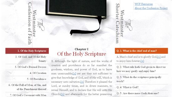
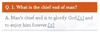
The Confession Project is an interactive version of the Westminster Confession of Faith, the Westminster Shorter Catechism, and the Nicene Creed. The purpose of The Confession Project is to clarify and organize these classic confessions in order that Christians can more easily take them in. As a member of the Presbyterian Church in America (PCA) the Westminster Confession of Faith was, of course, a natural choice. I'm by no means implying that it is the only legitimate confession (cough. It just happens to be the best one).
Design for a Confession
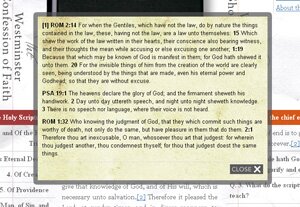
For many Christians who grew up outside the confessional church, this may be your first foray into the world of classical Christianity. I hope that The Confession Project will help enrich your understanding of Christian history and dispel some common myths about confessions. Even a cursory exploration of the site will reveal that it is more Bible than confession. Each point in the Westminster Confession of Faith is carefully (and sometimes tediously) footnoted with corresponding scripture proofs. On The Confession Project, I added in a footnote lightbox to make it easy to jump over to the scripture proofs. Clicking on any footnote marker will cause a footnote lightbox to pop up.
With the help of Spry, the built-in JavaScript library in Dreamweaver, I was able to produce a semantically correct XHTML page with helpful dynamic functions. The home page of the Westminster section actually contains the entire confession with key content hidden by default. As a visitor clicks on chapter links and catechism question, additional content is revealed. The footnotes are all contained in separate pages that are pulled in using AJAX. When styles and JavaScript are disabled, the site degrades gracefully and retains all of its core functions. In the near future I'll be adding print and mobile stylesheets.
- 8 Comments
- 1173 Views
Comments
Posted By: Jônatan Fróes on 12/31/08
nice project. Go ahead
Posted By: Matthew Griffin on 12/31/08
Thanks, Janatan.
Posted By: Mark Gring on 01/01/09
Matthew Your Confession Project looks really good. We are planning on making a link to it from our church website (above). Do you plan to do something on the larger catechism?
Posted By: Matt Griffin on 01/01/09
I wasn't planning on expanding to the larger catechism but I will be adding a couple additional creeds in the future that our pastor, Mike Philliber recommended. Thanks in advance for the link. Let me know if you have any questions or ideas you'd like to run by me.
Posted By: Joe on 01/02/09
I found you through Google (search words "li css". I thought I would say hello to another Christian web developer!
Posted By: Matthew Grffin on 01/02/09
Great to have you here, Joe.
Posted By: Gus on 01/02/09
A few things: 1. I think the aesthetic of your project is quite nice. The layout is fine, too, but it could use a bit of sharpening. 2. DreamWeaver's js framework is called Spry, not Spy. 3. Two of the three pages (over 66%) on your project do not actually validate. a. http://theconfessionproject.com/ line 23, you never opened the paragraph which you've closed. b. http://theconfessionproject.com/wmcf.html line 65, there's no tabindex attribute to divs. This looks like content generated by DreamWeaver. The vertical rules that run through the lists on either site of the WMCF are awfully distracting. I would recommend blurring them and/or dropping the opacity once they hit the lists. In any case, it looks pretty good and I really like the mirificampress site too. (although content above the navigation should be blurred or lowered in opacity and the search input's border should be styled.
Posted By: Matthew Grffin on 01/02/09
Thanks for the input, Gus. I was in a little bit of a hurry to get The Confession Project published which is the reason for some of the validation issues. You can see overall, though, that the XHTML is well structured and standards based. The other comments are constructive and well-taken, but I'm inclined to keep them the way they are for reasons I won't elaborate here.