Intro to Web Design (Part 1): Grasping the Core Concepts
January 21st, 2009 in Design Tips & Tutorials
by: Matthew Griffin
If you're a regular reader of Mirificam Press you know that most of my articles dealing with the mechanics of web design tend to focus in on very specific issues. And most of the time the issues I write about are geared toward intermediate or advanced web designers. As I recently began grouping sets of past articles together into related series, this characteristic came to the forefront. I realized that on Mirificam Press there is a lack of articles relating the core concepts and techniques of web design. With the fly-by-the-seat-of-your-pants nature of our unique vocation I think its important that I present a cohesive primer on the technical concepts that form the foundation of web design.

Since with little effort and a good WYSIWYG editor a novice web designer can produce a product that looks similar to what an expert would produce, it's not uncommon for a web designer to start learning in the middle rather than the beginning. For me, it was Microsoft Front Page first and HTML didn't come until years later. After I got the Front Page thing down, I started looking for online tutorials that would show me how to do the "cool stuff" I saw on other websites. Then came my first few clients and it wasn't long until I heard, "I don't like the font. Can you change it?" And then came the infamous, "My website looks weird on my computer. Why doesn't it look the same on all computers?" Needless to say, I didn't have very good answers and the solutions I did have were incredibly tedious. I should have started at the beginning. This article series will walk through those important techniques and concepts I missed during the first go around. It will be perfect for newbies but also a good supplement for intermediate and advanced designers who started out like me.
Understanding The Layers of a Web Page
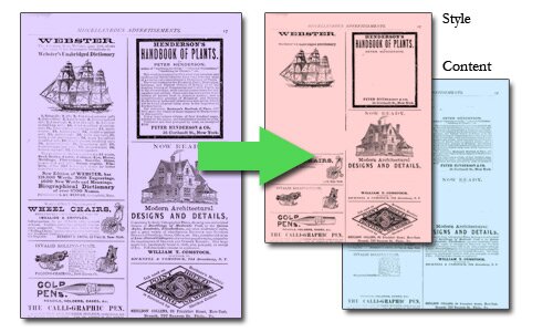
As you read this page, you are being presented with a polished graphical design housing text content. On the surface, it looks like a printed newspaper or magazine—every graphic element fits neatly into its place. But under the surface, this page is much more than any printed product. It is truly a revolution in the world of information. The secret is in the web page's separation of style and information.

When a newspaper is printed, the style of the product (typeface, font size, layout, etc.) is inseparably fused with the content (text, articles, headlines, etc.) We humans then use visual indicators embedded in the style to navigate the newspaper. For example, we know that headlines are bold and larger than body copy, so we scan the layout for large bold text and then proceed to read the body text of the article. This is how the average person is used to reading and understanding design. We use the style to determine the meaning of the content we are reading. That's why it can be difficult at first when making the transition to web design. Web design forces you to look at design from a different perspective—consider different issues. It forces you to think of the same content in two layers: content and style.
The Content Layer
When a web page is built properly, the content is completely separated from the style. The content layer is tagged with special indicators that help search engines and other programs understand how the information on the page is organized. These tags also help ensure that the information on the page can be read in an organized fashion by anyone and everyone from the cyber-geek with the latest setup to the blind person with nothing but a screen reader. The content layer is written in a markup language called HTML and can be created with as little as a plain text editor such as MS Notepad. But, of course, if you're going to get serious about web design you'll want to look into a more professional HTML editor.
Developing a proper content layer requires good analytical skills and a knack for organization. If you enjoy free style painting and hate practical problem solving, then you should probably rethink your plunge into the web design world. On the other hand, you may find it to be just the dose of uniformity you need. I'll talk more about HTML and semantic tagging in the second part of this series.
The Style Layer
Understanding how to build a content layer is the very first skill you should master as an aspiring web designer. Following closely after, though, is the style layer. The style layer tells the web browser what the content layer should look like to the visitor. The style layer of a web page sits in a completely separate file and is written in a language called CSS (Cascading Stylesheets).
Some of the more universal benefits of separating style from content are a broader user base, better search engine placement, but without these benefits CSS would still be the way to go. Two words: centralized control. In the old days, when I was building sloppy websites, my style was always fused with my content. Anytime I needed to make a site-wide change like font size, I had to go to each page and change the font size on every block of text. No big deal on a one page website, but imagine trying to change the font size this way on a hundred pages. That's a lot of work for a little change. And if for some reason I needed to make a layout change (For example, if I wanted to make the content you're reading move half and inch closer to the left side of the screen) forget about it! But if my style had all been in one file, I could have changed one single line of code and, presto! done. I'll talk more about graphic design and building stylesheets in the third part of this series.
The style layer is all about taking the information in the content layer and making it easy to navigate and pleasing to the eye. Building a good style layer also requires good organizational skills but you'll find that natural artistic talent and intuition go a long way in this department as well. If you enjoy computer programming and hate fine art, then you should probably rethink your plunge into the web design world. On the other hand, you may find it to be just the dose of mysticism you need.
Wrapping Up
This article should be just enough for you to start thinking in the categories required by web design. I'll be spending the majority of the series exploring and fleshing out the concepts described above but I will be dedicating the fourth and last article to the peripheral technologies of web design: Javascript, Server-side programming, and Flash.
- 22 Comments
- 10264 Views
Comments
Posted By: Kurtis C on 01/22/09
Great article, very much enjoyed the read. I knew most of it, but its useful none the less, especially to those who are new!
Posted By: Marisa on 01/22/09
Good article. I have found that there aren't a lot of useful articles on the basics of web design. You have explained and introduced it very well and I am looking forward to reading the rest of the series!
Posted By: Matthew Grffin on 01/22/09
Thanks for the comments.
Posted By: joyoge designers' bookmark on 01/24/09
nice post thanks..
Posted By: grace on 06/04/09
Iloveto design
Posted By: Italy Wine Tours on 06/09/09
Matthew: Thanks for this nice introduction to layering (and congratulations on a very stylish site as well).
Posted By: houston bankruptcy attorney on 08/25/09
The content layer feeds the search engine spiders where as the style layer keeps the content well organized with a common layout to all web pages. Thus, as a intermediate web designer you should have a sufficient knowledge of both HTML & CSS.
Posted By: Logan Real Estate - Lisa Udy on 09/18/09
I have recently started setting up web pages of my own, and this article was good for a newbie like me. Thank you. I have been experimenting with my calls to actions, using different colors, bigger/smaller fonts, page placements, and the results are quite intriguing. You are right that it's human nature, almost at the basic level we learn in early years of our life, important things on paper are bright and colorful with big fonts. It works. Great post!
Posted By: Web Design Singapore on 10/09/09
nice post.