Intro to Web Design (Part 3): Styling the Web with CSS
February 18th, 2009 in Design Tips & Tutorials
by: Matthew Griffin
We talked about the content layer in the last article of this series. If don't know anything about HTML, and especially if you already know HTML, I recommend going back and reading it. This article is about style. The style layer of a web page is what makes it enjoyable for humans. Search engines and other robots are perfectly happy with just the content layer, but for the web to be human it has to have style.

A Little About CSS
The style layer of a web page is written in a language called CSS (Cascading Stylesheets). This CSS code typically resides in a file separate from the HTML pages that make up a website. This makes it easy to make site-wide style changes without editing each individual web page. CSS can also be added directly into an HTML page but this is rarely a good idea as it nullifies the most important benefit of CSS.
Like HTML, CSS is not a programming language. It's a style language. It tells a visitor's browser what each piece of content on a web page should look like. To create a CSS file, just open up a plain text editor such as MS Notepad and save the file as "styles.css". It doesn't have to be called "styles". Just make sure you save it in the same directory as your HTML web page. You can choose any name you like. Next, you will need to link that CSS file to an HTML web page. The code you will use to link the CSS file will go in the <head> of the HTML and will look something like this:
<link type="text/css" rel="stylesheet" href="styles.css" />
This little snippet of HTML code tells the browser to look for a stylesheet called styles.css in the same directory as the web page. Now, all you have to do is fill the CSS file with styles.
Writing Basic CSS to Set Up the Page
For the purposes of this article, I'll be borrowing the HTML code from the previous part in the series. If you need a refresher on what all this HTML code means, just refer back to the previous article. Here's the HTML code with my code snippet from above added into the <head>.
<!DOCTYPE html PUBLIC "-//W3C//DTD XHTML 1.0 Transitional//EN" "http://www.w3.org/TR/xhtml1/DTD/xhtml1-transitional.dtd">
<html xmlns="http://www.w3.org/1999/xhtml">
<head>
<meta http-equiv="Content-Type" content="text/html; charset=utf-8" />
<title>A-1 Widget Makers</title>
<link type="text/css" rel="stylesheet" href="styles.css" />
</head>
<body>
<div id="header">
<h1>A-1 Widget Makers</h1>
<ul>
<li class="home"><a href="index.html">Home</a></li>
<li class="history"><a href="history.html">History</a></li>
<li class="contact"><a href="contact.html">Contact</a></li>
</ul>
</div>
<!-- header end -->
<div id="content">
<h2>The History of A-1 Widget Makers</h2>
<p>A-1 Widget Makers has beenfamily owned since 1943. We makethe best widgets in the West Texasareas and we'll beat any competitor'sprice.</p>
</div>
<!-- content end -->
<div id="footer">
Copyright 2009 A-1 Widget Makers
</div>
<!-- footer end -->
</body>
</html>
Now, I'm going to open my CSS file and start adding universal styles. Universal style are the styles that apply to the most elementary of aspects of design. They include things like default font, default text color, page background color, and link color. Here's what I'll start with:
body {
font-family: Georgia, "Times New Roman", Times, serif;
font-size: 14px;
color: #666;
text-align: left;
background: #fff;
}
* {
padding: 0;
margin: 0;
}
a {
color: #09c;
text-decoration: underline;
}
a:hover {
text-decoration: none;
}
p {
margin-bottom: 20px;
}
h2, h3{
color: #000;
margin-bottom: 20px;
}
I realize this is a lot to take in all at once if you have never used CSS before so lets walk through it one selector at a time starting with "body". On the very first line, you'll see the word "body" followed by a curly bracket. All the instructions between this opening curly bracket and the closing curly bracket apply to the <body> tag of the web page. Also, since the <body> tag wraps around all the content in the the web page, I'm also setting default styles for the whole page. This means that styles like "font-family" which are set in the body selector will automatically be inherited by all the other tags in the page. In the body selector, I set the font family, font size, page background color, color of the text on the page, and I set the text alignment to left align.
The next selector in the list is the asterisk. The asterisk represents all HTML tags. In this case I have reset the padding and margin on all HTML tags to 0. This is a good habit to get in to because some browser differ in their default padding for various HTML tags.
Next, I have added selectors for a, a:hover, p, h2, and h3. The "a" selector tells the browser what links should look like. In this case I've set the color of my links to a light blue with a default underline. The "a:hover" selector tells the browser what a link should look like when the mouse is placed over it. I've instructed the browser to remove the underline below links when a mouse is placed over them. As for the p, h2, and h3, I simply gave them a bottom margin of 20 pixels and set the color of my heading 2 and 3 to black. You'll notice that for h2 and h3 instead of writing a separate selector for each, I combined them by separating them with a comma. This is a trick that can save a lot of typing when you have two HTML elements with the same style.
Go ahead and open the page with a browser now. You should see something like this:

Not exactly ready for prime time but it's starting to look a little more appealing.
Adding Design and Layout with CSS
I've already set the universals, but what we have now is really just a fluffy version of the content layer we started with. Now it's time to add layout and visual design. I'll start by giving you the code to add to the CSS file and then I'll walk through it step by step similar to above. Remember, this code should be added to the CSS you already have from the example above. To see the complete example in action, go here.
/* Layout Styles */
#header, #content, #footer {
width: 720px;
padding: 20px;
margin: 0 0 0 20px;
}
#header {
position: relative;
height: 60px;
border-bottom: 1px solid #666;
}
#header ul {
position: absolute;
top: 65px;
left: 550px;
}
#header ul li {
list-style: none;
float: left;
margin-right: 20px;
}
#content {
border-bottom: 1px solid #666;
}
#footer {
background: #eee;
}
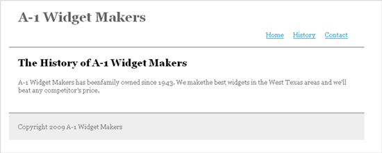
When you preview the changes in a browser, it should look something like this:

Using ID Selectors to Change the Layout
There's an important difference between this new code I just added and and what I wrote in the universal styles section. Right away, you'll notice that I have "#" preceding every selector. That is because the selectors in this section of the CSS file apply to specific tags which have been given an id. The universal styles I wrote in the first example apply to preexisting HTML tags (body, h2, h3, etc.)
The first selector reads "#header, #content, #footer". This means that all the instructions between the following curly brackets will apply to the HTML tags with the ids "header", "content", and "footer". If you look back at the HTML code, you will see that the line directly after the opening <body> tag looks like this <div id="header">. Ah ha! There's the tag with the id "header". Looking down through the rest of the code, you'll find "content" and then "footer" at the very bottom.
What I've done with this first selector in the layout CSS is set all of these HTML tags (header, content, and footer) to 720 pixels wide. Then I gave them all a padding all the way around of 20 pixels. Finally, I gave them all of margin of 20 pixels on the left side so the content in all of these areas will sit a little bit away from the left edge of the page. The margin attribute may look a little funny to you. The margin attribute takes four arguments: top, right, bottom, and left in that order. So "margin: 0 0 0 20px;" means 0 margin on the top, right, and bottom, and a 20 pixel margin on the left.
Header
The next selector in this section of my CSS reads "#header". As I explained above all the attributes set in this selector will apply to HTML tags with the id "header". In this example I started by setting the #header position to "relative". You'll learn more about what this does in a moment. Next, I set the height of the header to 60px and gave it a 1px wide gray border along its bottom edge. No big surprised here.
Now I'm going to get into CSS hierarchy a little bit. The #header selector is straight forward, but now I need to select the <ul> tag nested within my #header tag. That <ul> tag is where my navigation links are. To do this I use a selector that looks like this: #header ul. This selector will affect all <ul> tags nested inside an HTML tag with the id "header". In the example above it's pretty easy because there is only one <ul> tag inside the #header tag. If there were more than one <ul> tag, I would have to give each <ul> tag its own id (eg. "nav_one" and "nav_two") and then I could select them in my CSS file with a selector like this: #header ul#nav_one. But for now we'll just stick with the example.
First, I set the position of my navigation <ul> to "absolute". This places all the content in the <ul> in the upper left-hand corner of its parent container. In this case the parent container is #header. The next two lines offset the <ul> from the top and the left so that the navigation links appear in the lower right-hand corner of the header. Remember earlier when I set the #header position to "relative". If I hadn't done that, setting the <ul> position to "absolute" would have placed it in the upper left-hand corner of the entire page and my offset attributes would have been calculated from there. This is an important behavior to remember. Always set HTML elements to position:relative if they contain nested elements that are going to be positioned absolutely.
Next, I move on to the <li> tags nested within the <ul> tags. I'm getting deeper into the hierarchy now and you should be getting a better idea of how the selectors work. This selector looks like this: #header ul li. This will affect all the <li> tags nested in <ul> tags which are nested in an HTML tag with the id of "header". Whew! That was a mouthful. In this selector I set the list-style to "none". This takes the default dot off each list item. Then I floated them to the left. This makes the list item appear side by side instead on one on top of the other. Finally, I gave each link a margin-right of 20 pixels. This just spaces them all out a little bit.
Content and Footer
Compared to the intricacies of the header, the content and footer elements are a breeze. I just gave the content a gray border on it's bottom edge and set the background of the footer to a light gray. All the padding and width attributes for these two elements were already set in the first selector in the layout section of my CSS.
Wrapping Up
There's so much more to learn about the style layer. The introduction above honestly barely even qualifies as an introduction. But hopefully it will get you thinking in the right direction and you can fill in the holes as you go along. Fortunately, I have built up quite an archive of CSS tricks and tutorials so I'll leave you with a list I think will satisfy most of your basic CSS instructional needs. You can also see the example above in action here.
- Two Column CSS Layout: The Absolute Basics
- The Amazing LI: Using CSS and Unordered List Items to Do Just About Anything
- Pushing the Limits (Part 1): The Perfectly Semantic Three Column CSS Layout
- Pushing the Limits (Part 2): A Simple Four Column CSS Layout with a Little Divitis
- Pushing the Limits (Part 3): Building a Semantic Four-column CSS Layout
- In the Background: Simplifying and Demystifying CSS Backgrounds
- Beautiful CSS: Organizing Your Stylesheets
- Rollover Lite: A CSS Rollover Everyone Can Enjoy
- 12 Comments
- 7298 Views
Comments
Posted By: Othella on 02/18/09
Your first link is broken :( But your tuts for beginners are great! :)
Posted By: Matthew Griffin on 02/18/09
Thanks, I'll get that fixed.
Posted By: Eugene Real Estate Agents on 02/19/09
I literally stumbled across this and found it quite interesting since I've been working on my own WP designs. I know HTML quite good but I am hacking around with PHP & CSS. Thanks for the information and now I'm going to look through your other links. :)
Posted By: Matthew Griffin on 02/19/09
Great. I hope you find the other articles helpful.