Use the links below to share Photoshop Tutorial: Quick Glass Buttons for the Web Designer on your favorite social networks.
Back to the Article >>
Photoshop Tutorial: Quick Glass Buttons for the Web Designer
January 23rd, 2008 in Design Tips & Tutorials
by: Matthew Griffin
For a clean, impressive looking button set that doesn't take up a bunch of design time, glass buttons are the way to go. And slapping together cool glass buttons like the ones on apple.com is extremely simple in Photoshop. I've been using this process for several years now and I know web designers will find it helpful. It's essentially three steps and I found that after I perfected the technique, I could fly through it in a matter of seconds.
Step 1: Build a Base
For the purposes of this tutorial start with a fresh canvas that's 150px wide and 30px high. Select the rounded rectangle tool and set the radius to 10px . Now draw a rounded rectangle that fills the entire canvas (Fig 1-1). Don't worry about the color for now. Next, double-click on the layer where your rounded rectangle is. In the blending options dialog box that pops up, select the "gradient overlay" effect in the left-hand column. This will bring up a set of options in the right-hand column. By default, these options should be identical to the ones in Fig 1-2. If not, adjust them to match.
Fig 1-1
Fig 1-2
Next, click on the gradient bar to bring up color and opacity options for the gradient effect. We are going to build a blue button so set the dark and light ends of the gradient to match Fig 1-3.
Fig 1-3
Once you apply the changes to your rounded rectangle, you will have something that looks like Fig 1-4. That's all for step one. Now it's time to make it look glassy.
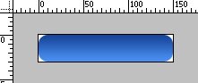
Fig 1-4
Step 2: Making it Glassy
Now that you have your base, you will need to add a layer of reflection to achieve the appearance of glass. Select the rounded rectangle tool  again and maintain your 10px radius. But this time draw a rounded rectangle that's about 1 or 2px inside your original one Fig 2-1. It's important that your newly drawn shape be placed in a separate layer above your original one. Double click on the layer containing your new rounded rectangle to bring up the blending options. In the right hand column of the blending options dialog box under the advanced blending section, change the fill opacity to 0% (Fig 2-2). This makes the original color of the rectangle transparent.
Fig 2-1
Fig 2-2
Now, just like your first rounded rectangle, check the gradient overlay checkbox 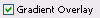 in the left column. Once again the gradient effect options will pop up in the right column and you will again click the gradient bar
 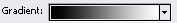 to bring up gradient color and opacity options. But this time you are going to do something a little more complicated. First set both the light and dark ends of the gradient to pure white. Next, you need to change the opacity of the color on the right side of the gradient bar to 0%. You can do this by clicking the pointer at the top-right corner of the gradient bar, and then changing the "opacity" field to 0. Once you've done that, click and drag the same opacity pointer a little past the center of the gradient bar. The result should look like Fig 2-3.
Fig 2-3
Finally, you can change the opacity of the color on the left side of the gradient bar to make the glass effect softer (like jelly) or harsher (like glass). I like to set mine at about 85%. Once you have applied all of the effects and gotten out of the blending options dialog box, your button should look like Fig 2-4. Just one more step to go.
Fig 2-4
Step 3: Adding Text
The final and least complicated step is adding text to the button. Using the text tool create a new text box and type white letters in it that say "Send Email" (Fig 3-1). One last time, double-click the new layer containing your text to bring up blending options. This time, check the "outer glow" check box in the left column. When the outer glow options show up in right column, you will need to make some adjustments. (1)Change the blend mode to "normal", (2) set the opacity to 100%, change the "color" to the same as the darkest blue in your button, and (3) move the "size" to 8px. Your final configuration should look like Fig 3-2.
Fig 3-1
Fig 3-2
When you apply your changes, the result should look something like Fig 3-3.
Fig 3-3
Conclusion
I tried to include as much detail as possible to make this tutorial as accessible as possible. If you want to take it a step further, try messing with a dark inner glow on the base rounded rectangle. It's an extra step but it can enhance the gelatin quality of the button. Comments, questions, and corrections are welcome.
- 82 Comments
- 38523 Views