Use the links below to share Total Redesign: Mirificam Press Dissected on your favorite social networks.
Back to the Article >>
Total Redesign: Mirificam Press Dissected
June 23rd, 2008 in Design Inspiration
by: Matthew Griffin
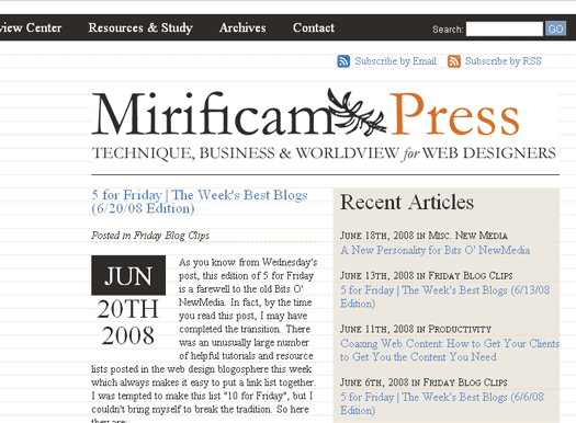
Bits O' NewMedia has officially made the transformation into Mirificam Press (as you can see). The task of creating a new design that fit the personality and direction of the blog ended up being more difficult than I had anticipated. At least part of the difficulty was due to the fact that I didn't have any constraints. I've become so accustomed to doing things within the client/designer relationship that I almost forgot how to work for myself. My wife would probably argue that, in reality, I just substituted her for the client and never actually broke out of the client/designer relationship. I'm sure, "What do you think about this?", isn't her favorite question right now. But I digress. Through all this, I was able slow down and make precise and deliberate design decisions that I'm not always at liberty to make in other situations. I'd like to kick off the new site by dissecting the new design and features.Type Hierarchy and Guiding Color

Since this site is a high text content site, my primary objective in its redesign was readability. The information architecture behind Bits O' NewMedia worked well for fifty articles, but wasn't able to scale very well beyond that without losing important articles in a cluttered archive. This is why Mirificam Press is a more typography-driven site than Bits O' NewMedia. It became clear that is would be important to use use colors and type more subtly and consistently to guide visitors. I kept the color palette simple and graphic devices minimal. The blueish color is used consistently throughout the site to denote links (except for the main navigation in the header). Orange is used to signify headers of importance: article titles, page titles, and major page sections like comments. Finally, the light beige/cream color serves as a focus box background and focus box borders. You'll also notice a consistent graduation of text size and transformation throughout the site that will help visitors understand what titles and text are most important from page to page.
The Baseline Grid
Although it's a common tool in print design, the baseline grid was a new concept for me. The idea is that by using a consistent line-height for your text graphical elements throughout a site, an eye-pleasing vertical symmetry can be created. In the case of Mirificam Press, I set my default line-height to 18 pixels. This means that from the baseline of one line of text to the baseline of another is exactly 18 pixels. If the text size of any heading exceeds 18 pixels, then the line height of that heading has to be adjusted up to the nearest multiple of 18. The same thing goes for top and bottom margins and padding. They all have to be multiples of 18. Here's an example of what the home page looks like with an 18 pixel horizontal line grid behind it. You can see that every line of text fits perfectly into the grid. If you'd like to see a live version, you can go here.
Unfortunately, building a good baseline grid is difficult when you're using EM or percentage measurements. I had to use a pixel measurement for all of the elements of the layout which means that the layout doesn't fare very well when a visitor manually adjusts browser text size. It's not optimal but the site still remains fairly accessible for those darn text size changers.
Good Markup Makes All the Difference
I don't think it's possible to understand how important good HTML markup is until you try to move a blog to a new design. Fortunately, I consistently used H3 tags for sub-headers, UL tags for lists, P tags for paragraphs, etc. I also used consistent classes for floating images which makes it easy to restyle them for the new site. I can't imagine what nightmare this change would have been had I been sloppy with my markup. As it stands, most of my archived articles fit perfectly into the stylesheet.
The old Bits O' NewMedia template, on the other hand, was not as light-weight or semantic as it could have been. The Mirificam Press template markup is a significant improvement in this area. If you use the Firefox web developer tool bar, you can disable styles and you will see something that looks like this (or go here for a live look):
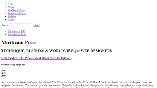
Take a peek at the source code, you will see light, well-formed XHTML that uses semantic markup for headings, navigation, etc. Of course, just like Bit O' NewMedia, Mirificam Press has a print stylesheet and I plan on looking into a mobile stylesheet in the near future. Be sure I'll also post a mobile stylesheet tutorial when I finish.
Easier Layout
Bits O' NewMedia followed the traditional two-column blog layout pretty closely. But as content increased, I found that the two-column blog layout wasn't the best fit. Articles tend to pile up on the home page making for endless scrolling and the persistent right-column content that gets pulled up on sub pages whether or not it's relevant.
The home page layout on Mirificam Press features a teaser for the most recent article and a list of seven preceding articles, all in the initial viewable area. Scrolling down reveals a three-column feature box that provides quick access to articles by topic, and most views. The sub-pages on Mirificam Press are in an uncluttered one-column layout. This change from the home page to the sub pages makes them easier to read and less confusing overall.
If you're sporting a modern browser, you'll get a persistent fixed navigation bar as you scroll down the screen along with a fixed background. The fixed navigation has obvious benefits but I wanted to do something more that just beneficial—I wanted something that was different and cool (This is a design blog after all). I ended up playing with the fixed background and pushing the nav bar down a little so the content shows through in the little gap at the top of the screen as the page scrolls. Hey, it's something, right?
Resources and Study
I've spent most of this article explaining the technical qualities of the new site. But this change isn't strictly an image adjustment; it's also a content reorganization. Writing articles (especially Christian worldview articles) on Bits O' NewMedia was great, but the here-today-gone-tomorrow system that drives the typical blog makes it difficult to develop a complete system of thought on a particular issue. The Resources and Study page is an attempt to fix this dilemma. I will continually expand and update it with resources for not only becoming a great web designer, but becoming a great web designer with a solid Christian worldview. Eventually, I plan to compile a comprehensive curriculum to this end. For now, you can go there for recommended websites, blogs, and resources.
The Worldview Center page is another page that will be updated frequently. Worldview is one of the most important concepts for Christian designers to understand and embrace if we are ever going to engage and impact culture. Unfortunately, as a complete system of thought, it can't be explained in one article. The Worldview Center will provide a place for web designers who are new to the concepts of worldview to catchup. In the future, I'll be moving into deeper and more specific areas of worldview in web design and, rather than rehash the basics every time, I'll point to the Worldview Center as a primer.
- 11 Comments
- 1552 Views