Use the links below to share Mission Impossible: A Diagonal Nav Rollover Effect with CSS on your favorite social networks.
Back to the Article >>
Mission Impossible: A Diagonal Nav Rollover Effect with CSS
November 25th, 2008 in Design Tips & Tutorials
by: Matthew Griffin
The HTML rendering model is based on boxes. Every element of a web page is a box set on a grid. Now, this doesn't necessarily mean that our graphics all have to be squares and rectangles. Over the years we've gotten pretty creative in our attempts to break the grid (or at least create the illusion that we've broken the grid). Still, there are limitations we've come to accept. One of them is the inability to build an overlapping diagonal navigation. Without using image maps and complicated Javascript, it's a task that seems almost impossible. In this article, I'm going to share a method I developed to overcome the problem. When you're finished with the tutorial, you'll have a simple, semantic, diagonal set of navigation buttons (rollover effect included).
My Nav HTML
In this example, I'm not going to build a complete layout. You can search through my other articles for that. Instead, I'm going to focus in on the header and the navigation. If you want to see the end result, go HERE for a live working example. Here's the XHTML you should start with:
<ul class="nav">
<li class="home"><a href="#">Home</a></li>
<li class="about"><a href="#">About Us</a></li>
<li class="downloads"><a href="#">Downloads</a></li>
<li class="contact"><a href="#">Contact Us</a></li>
</ul>
</div>
Put this XHTML into the body tag of your page. As you can see, we are starting with simple semantic markup that will degrade gracefully in just about any browser.
Building Buttons
For now, I'm going to leave the markup alone and show you how to set up your button graphics. For this example you will need to build four link buttons. Each button will be exactly 200px high and 149px wide with a transparent background. Once you have the inactive state button finished, you need to double the height of the canvas at the bottom. Then you will duplicate your button on the bottom half of the canvas. The duplicate button will serve as the active state button so you will need change its color accordingly. When you're finished, you should have something like this:
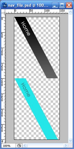
If you don't want to take the time to build it yourself, you can download the Photoshop file HERE.
Now that you have your button ready, go to FILE>>SAVE FOR WEB. Set the format to GIF, maintain the transparency with a white matte, and save the file as 001.gif (this will be the home link button) in a directory that's easily accessible to the XHTML page you built earlier. Once you're finished, repeat the process for three more buttons, naming them 002.gif (About Us), 003.gif (Downloads), and 004.gif (Contact Us) respectively.
Styling the Diagonal Nav
Okay, at this point, you should have a web page with navigational links and all of your buttons ready to go. All you have to do now is make them look good. Go ahead and add this CSS to your document:
margin: 0;
padding: 0;
}
#header {
position:relative;
width: 400px;
height: 150px;
overflow: hidden;
margin: 10px;
border-top: 5px solid #000;
}
#header .nav li {
position: absolute;
list-style: none;
}
#header .nav li a {
display: block;
width: 200px;
height: 150px;
text-indent: -9999px;
}
#header .nav li.home { left: 0; }
#header .nav li.home a { background:url(images/diagonal_nav/001.gif) no-repeat; }
#header .nav li.home a:hover { background:url(images/diagonal_nav/001.gif) no-repeat 0 -200px; }
#header .nav li.about { left: 60px; }
#header .nav li.about a { background:url(images/diagonal_nav/002.gif) no-repeat; }
#header .nav li.about a:hover { background:url(images/diagonal_nav/002.gif) no-repeat 0 -200px; }
#header .nav li.downloads { left: 120px; }
#header .nav li.downloads a { background:url(images/diagonal_nav/003.gif) no-repeat; }
#header .nav li.downloads a:hover { background:url(images/diagonal_nav/003.gif) no-repeat 0 -200px; }
#header .nav li.contact { left: 180px; }
#header .nav li.contact a { background:url(images/diagonal_nav/004.gif) no-repeat; }
#header .nav li.contact a:hover { background:url(images/diagonal_nav/004.gif) no-repeat 0 -200px; }
For the purposes of this example I placed the CSS in the head of the XHTML document, but you can pull it in with a link tag just as easily. The first block of CSS code you see resets the padding and margin on all HTML elements. The asterisk just means "everything".
In the next block where the #header is being styled, notice that the position is set to "relative". This is important because we need to be able to set nav buttons to absolute positions within the header div. If you left that attribute alone, and tried to absolutely position your buttons, you would find that they would position themselves in relation to the whole page rather than in relation to the #header div.
Next, you can see that the list items and links within the .nav list are being styled with general attributes. The lis are set to position: absolute so we can overlap the nav buttons. The links inside the .nav lis are set to display:block. This makes them function like a div functions, rather than inline. Next, the links are set to the height and width of a single nave button (200x150), and the text within the link is indented far enough negatively to make it invisible. Search engines and certain old or mobile browsers can still see the text links, but modern browsers will display only the cool button graphics.
Finally, at the bottom of the CSS code, you will see our styles for the individual buttons. Each nav button has a corresponding three lines of code. The first line positions the button a certain number of pixels away from the left corner of the #header div. The next line sets the background of the link to the corresponding button graphic. And the last line changes the position of the nav graphic when the mouse is placed over the button. This exposes the bottom half of the nav graphic so the active state is visible.
Of course, we haven't actually broken the grid model at all. We've only manipulated the visual output by overlapping buttons with transparent backgrounds. The active link areas are still boxes.
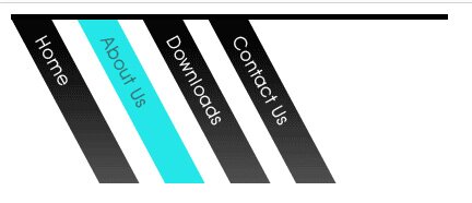
When you preview the page in a browser, the result should look like this:
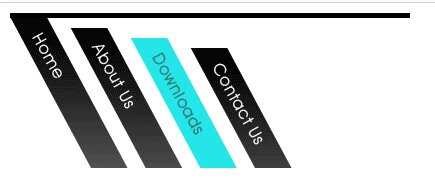
You can also stagger the buttons from the top for an effect that looks like this:
For a full working example go HERE.
- 55 Comments
- 16454 Views