Use the links below to share Grunge Design: Why It's Cool to be Broken and Disheveled on your favorite social networks.
Back to the Article >>
Grunge Design: Why It's Cool to be Broken and Disheveled
April 15th, 2009 in Web Design Worldview
by: Matthew Griffin
In a recent 5 for Friday post I received a question from Hungarian designer Steve Herrmann.
Why is the visual appearance of NetGen broken and disheveled? Look at their page layout, their typography, images, clothing, mismatched styles, hairstyles,...Why?
In the past I've analyzed the worldview behind various design movements, but I've tried to stick to the ones that were very apparently berthed from a philosophy. It's easy, for example, to look at the fathers of the De Sijl movement and quickly deduce the connection between their philosophy and its practical outworking. But dissecting modern design trends is much more complicated. An oil-and-water-like mixture of postmodernism and pragmatism has made a tangled mess of the philosophical waters. In order to accomplish the task, we'll have to take look back at one of the cognates of postmodernism, twentieth century existentialism. But first I'm going to clear up some common oversimplifications Christians are often guilty of concerning grunge style.
Looking Through a Grungy Christian Window
For Christians, especially those who are submerged in modern Christian culture, it's easy to make the mistake of looking at grungy design through the wrong hermeneutic glasses. We make a simple contrast of the grunge style which tends to be dark, corroded, and chaotic against the Biblical metaphors of good (light, life, order) and we come to the conclusion that the grunge aesthetic is simply the opposite of good—a symbolic rebellion against the aesthetic of God. This is an example of sitting in your own worldview while trying to understand another. You've got to get up off the couch if you're going to understand. There is a lot more at work here than a simple contrast between dark and light. I'll talk about the worldview at work in the grunge style in a moment.
The other mistake Christians make is more common among Christian designers. It's the mistake of accepting the styles of the times uncritically. Of all designers, Christians should be the most aware of the aesthetic culture of their day. To employ a particular style without first understanding its meaning and context is a dangerous game for a Christian to play in a fallen world. This is not to say that the style itself is necessarily evil, only that its use by Christian designers can be harnessed for evil if not properly handled.
Looking Back to the Existential Dilemma
As I mentioned earlier, the grunge style owes a great deal to twentieth century existentialism. Through the work of philosophers like Jean-Paul Sartre and Martin Heidegger, mid-twentieth century creatives, and to a large extent popular culture, were introduced to the existential dilemma—the dilemma of existence. It is an understanding of human existence that starts right here with humanity; not with God; not with knowing; not with ideal forms. It starts with the raw facts: we are here, we have no intrinsic knowledge of how we got here, what we are, or even where "here" is. We appear suddenly in space and time with no knowledge of and no real choice concerning the nature of that appearance. It is as if we have been hurled at random into a void. This is the dilemma of every individual human. The rest of existential philosophy is the working out of this dilemma and, unfortunately, it would take up too much time to even present a few of the most popular solutions. But that is alright because the only solution we're concerned with is the one that produced the grunge aesthetic.
The existential dilemma has been a ubiquitous theme in American movies and music for at least the last fifty years. Sometimes it is presented along with a solution; sometimes your are left hanging. But the dilemma is always the same. And out of the growth and evolution of existential thought during this time came the grunge rock movement of the late 1980s and 1990s. The modern grunge graphic style grew up right alongside grunge rock and I don't think you can truly understand the former without understanding the later.
The Emergence of the Grunge Aesthetic
Grunge rock has been used as the expression of a pessimistic answer to the existential question. It sees the "hurledness" of the human—the situation into which each human has been seemingly randomly placed—as ultimate bondage. Since we (humans) have no say in who we are at birth, or where our being will break forth into reality, or really anything concerning our existence at all, the only real good—the only real freedom—is found in breaking down and destroying the enslaving structures into which we are thrust. And this destructive attitude is not limited to specific structures (government, family, etc.) as in the punk rock movement. Rather, it extends out to every pre-existent structure a human encounters. It extends to the human body, nature, and even to the very means by which the grunge worldview has been primarily communicated—music. In an ironic twist, grunge rock uses music as a parody of life.
One of the clearest examples of a self-aware existential statement in grunge rock can be found in Kurt Cobain, one of the fathers of the modern grunge movement. Kurt used disconnected lyrics and garbled vocals to assault established structures. In this way he was able to communicate a message of anti-structure without hypocritically using a cohesive lyrical system to do so. For the instrumental side of his work, he incorporated coincidental elements of musical performance, such as feedback, which had traditionally been considered undesirable. This was a kind of auditory rust that acted as an extension of the anti-structure message.
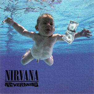
Now let's look at some of the art and design that accompanied the pessimistic existentialism of Kurt Cobain and his band Nirvana. Nirvana's breakout album "Nevermind" featured cover art (pictured right) that was as unique and arresting as the music itself. It pictured a lone detached human baby swimming under water after a dollar bill. Without understanding the basics of existential philosophy, this album cover could easily be dismissed as random silliness or, at most, a sophomoric attempt at an anti-materialism message. But that would be a mistake. This baby is a picture of the existential dilemma. He has been hurled into a watery void; no one is there to assist him; no sign is there to comfort or direct him. All he can see is the pre-existent structure in front of him (money) so he swims for it, but we can see that it's a trap as the money is attached to a fishing hook. Understand that the point is not the evil of money per se. The money could be exchanged for any symbol of pre-existent structure. Notice also that the style of the cover is actually quite clean cut—not at all what we'd expect from grunge design. There is no dark grittiness, no rust or rotted wood, no graffiti-like typography. Here we see a profound example of how philosophy precedes style.
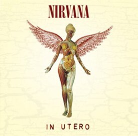
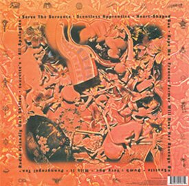
Nirvana's Next album "In Utero" (pictured below) continued in the spirit of "Nevermind", featuring an angelic figure whose skin has been removed to reveal her organs and muscles. Metaphorically, her angelic exterior has been pulled away to expose her for what she is—a pile of flesh, bound by the pre-existent structures of her own body. On the back of the album is a closeup shot of a mass of human fetuses randomly strewn about. Again we are confronted with a picture of the human "hurledness" into a chaotic mass of tiny human bodies. It was shortly after recording "In Utero" that Kurt Cobain took his own life in what I consider a hemmingway-like fist shake at the final structural barrier left to destroy—the human situation itself.
The aesthetic that grew out of the grunge movement of the Nirvana era was, well, grungy. The creatives who adopted the grunge worldview started utilizing visual devices and themes that symbolized anti-structure. Quite naturally their visual vocabulary consisted of rust, grime, and decaying organic matter. At first the the grunge aesthetic was subversive and antinomian but as grunge seeped slowly into mainstream design, it eventually became a corporate institution itself—one fixture in the pantheon of marketing tools. Today, I would say the percentage of designers who truly embrace the grunge style as an outworking of their own philosophy is small. Postmodernism has absorbed grunge into the "dude, that's cool" rainbow of all-inclusive design theory. But Christians should know better.
Christianity vs. Grunge: Round One
How should a Christian designer approach broken and disheveled design styles like grunge? I explained earlier that Christian designers should understand grunge design and handle it carefully, but that is pretty vague. The first solid step to understanding your relationship to design styles borne out of unchristian philosophies is to separate the thing from the philosophy. Is it wrong to depict grime and decay? No. In fact, the Bible talks quite a lot about grime and decay, both in literal and symbolic form. It's the philosophy supporting the grunge style that's the problem.

Christianity and existentialism agree to some extent about the human condition, though they differ in their understanding of its cause. They can both agree that humans experience a sense of "hurledness" when it comes to existence. In fact, the book of Ecclesiastes in the Bible is probably one of the best expressions of the existential dilemma ever penned. But the similarities end when Christianity smashes existential angst with one doctrine—the doctrine of revelation, the Bible. Revelation in the Christian system is vital when contrasting Christianity with modern existentialism. And this means it is an especially vital doctrine in our time because existentialism and its child postmodernism are quickly becoming the dominant philosophies in western culture. Revelation completely crushes the existential dilemma because revelation is the point at which the infinite (God) reaches into the finite and explains the situation. Revelation relieves the anxiety of finitude by providing a guide from the only truly reliable source of truth—the all-knowing God and creator. You can see then why the debates within the Christian community surrounding the inerrancy and infallibility of the sacred scriptures run so hot. If we give up the doctrine of dependable revelation, we have lost everything. It is truly the crux of the divergence of existentialism from Christianity
Now, returning to grunge design... Christian designers are free to use decay as a visual tool within the Christian worldview. The Christian aesthetic is more complex than a simple chart of do and don't colors and styles. At the center of the Christian aesthetic is God himself in all his glory and truth. We can illuminate his character directly by using styles and visual devices that symbolize and communicate his holiness. But we can also negatively illuminate his character by exposing his antithesis.
Use the grunge style to the glory of God, but the minute you step outside Christianity and embrace the existentialism of the grunge aesthetic, you are out of line. Following this same line of thought, we should take time to analyze grunge design as we encounter it, recognizing some of its elements as good and true and others as false and evil. For example a particular website emulating the grunge style may be technically excellent and effective in its stated purpose, and for these qualities we can and should praise it. But if the underlying philosophy is wrong and its purpose illegitimate in the Christian worldview, we must temper our praise with criticism of these aspects. You may want to read my article Analyzing Web Design Through the Christian Worldview Lens for more detail on this subject. In the end, twentieth century existentialism and Christianity are completely incompatible, and Christian designers need to know why so we can properly attack this rampant falsehood in our generation and the generations to come.
- 70 Comments
- 13146 Views